versedvisual (slide 1 of 13)
versedvisual (slide 2 of 13)
versedvisual (slide 3 of 13)
versedvisual (slide 4 of 13)
versedvisual (slide 5 of 13)
versedvisual (slide 6 of 13)
versedvisual (slide 7 of 13)
versedvisual (slide 8 of 13)
versedvisual (slide 9 of 13)
versedvisual (slide 10 of 13)
versedvisual (slide 11 of 13)
versedvisual (slide 12 of 13)
versedvisual (slide 13 of 13)
1 / 13

Brand crush

versedvisual

Identity by versedvisual

tactile-typographytactile coastal resort, raw linen and silver

The texture of the raw linen completely grounds those tiny metallic beads, creating typography that catches the light and casts a physical shadow. By rendering the wordmark as a 3D, tactile object rather than a flat print, the branding demands a second look.

The portable idea

I am looking at how those little silver spheres cast real shadows on the fabric weave, turning a standard font into a piece of jewellery. If we swap a standard flat print for a raised or textured application on a natural material, the logo stops being a graphic and becomes a tactile feature. It gives people a reason to run their fingers over the brand name.

26 May 2026Brand study
Steal this for your brand world

Findie's translation of the move above into specific Sense2 products by industry. Pick the row that fits your brief — pricing is per piece at minimum order quantity.

This identity lives in our Boutique Hotel aesthetic — The feeling of checking into a beautiful hotel. Warm lighting, thoughtful details and products guests remember.

The Brand Move

Versed Visual: typography you could read with your eyes shut

Part of the boutique hotel aesthetic →

What makes it work

Versed Visual rendered a wordmark as tiny metallic beads on raw linen, 3D typography that catches light and throws a real shadow rather than sitting flat. Tactile typography grounds the metallic sparkle in honest coastal-resort texture so it reads considered, not flashy. This is the hotel-linen move made literal. For gifting it points to dimensional branding on natural materials, embroidered thread, applied beading, raised varnish over a matte base. The contrast between rough substrate and precise mark is what makes it feel expensive. Recipients respond to objects that reward touch, and a mark you can feel with a fingertip is one they'll remember with their hands.

What it signals

Boutique hotel is the aesthetic of considered hospitality — amber light, brass, cream linen, the feeling of being expected. Use it for gifts that should feel like a stay somewhere expensive: client welcomes, settlements, VIP events. It flatters the recipient rather than promoting the sender, which is exactly why it works.

Apply it to merchandise

This move translates naturally to Hotels & venues, Property developers, Private banking & wealth, Law & advisory firms, Airlines (premium cabins), and Wedding & event planners.

Who owns this look

  • Aman & Soho House:the template: monogram restraint, materials over marks
  • Aesop (amenities):the hotel-bathroom flex that upgraded an entire industry's amenity thinking
  • The Hoxton:warm mid-century hospitality branding that travels city to city
  • Halcyon House (Cabarita):Australia's coastal take on boutique-hotel identity

Why it matters now

  • Lightweight luxury

    2026's luxury packaging is shedding weight — premium now means considered materials and closures, not heavy boxes. Perfect for hotel-grade gifting.

  • Refillable prestige

    aluminium and refill systems are the new premium amenity standard — sustainability as a luxury feature, not a compromise.

  • Monogram revival

    quiet-luxury fashion brought back the small woven monogram; hotel-style gifts with initials-not-logos feel personal and expensive.

The psychology

Why we study brands we admire

Great identities are solved problems you get to inherit for free. Every brand crush in this collection made a decision — about material, restraint, colour, voice — that took them years to land. Studying the decision costs you four minutes and skips the years.

Apply the move

Carry this into your own merchandise

These products carry the move natively — each one described by its own product intelligence, the same way Findie reasons about it.

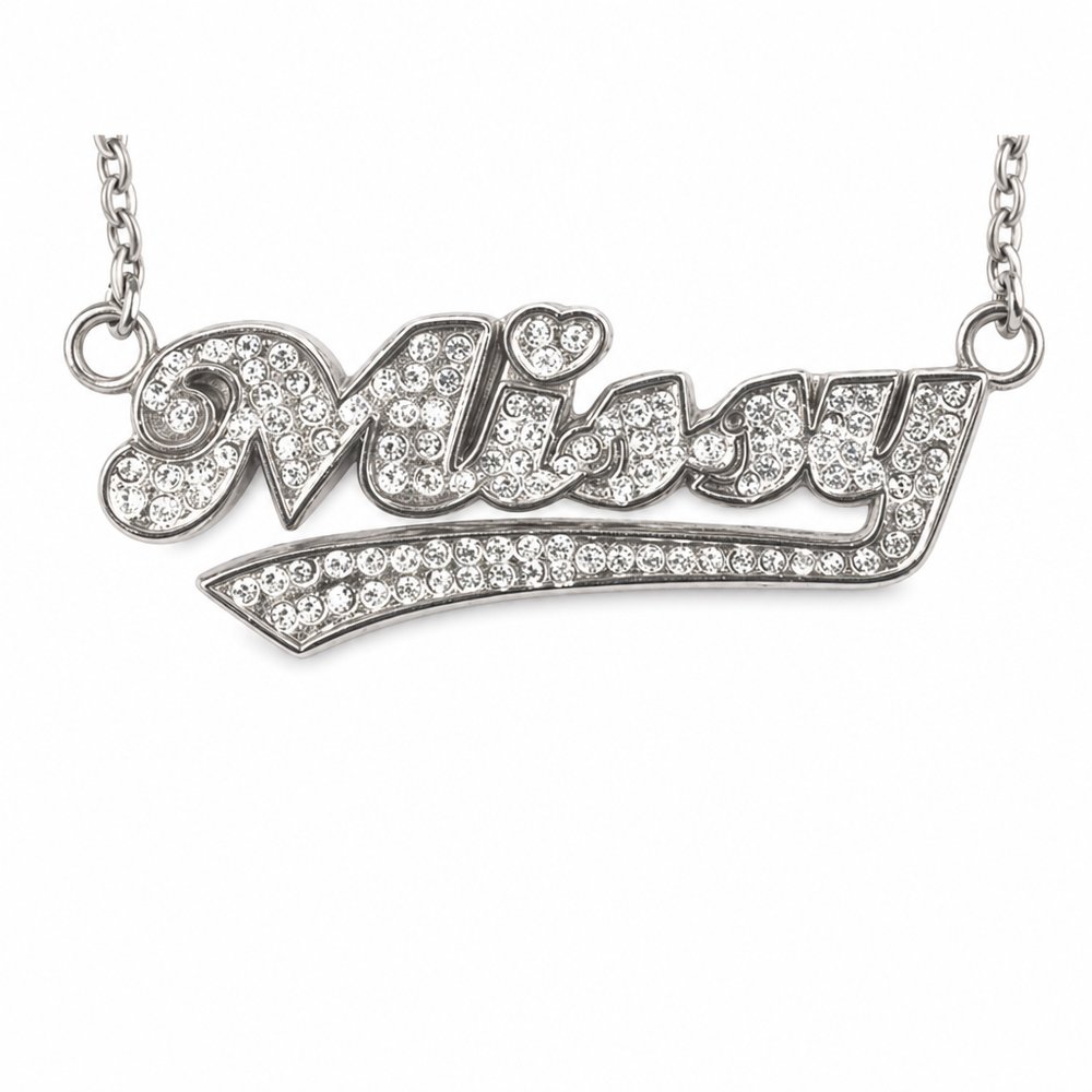
  • Diamante Necklaces
    Diamante Necklacesfrom NZ$10.58 ex GST

    Why it carries the move: a diamante necklace = the moment of being chosen, the spotlight that singles one person out and makes them shine — mirrors the jewelled, metallic typography approach perfectly.

    A boutique's loyalty customer → unwraps it at the counter and clasps it on before she's even out the door, glancing at the mirror once.

  • Bamboo Tote Bags (Short Handle)
    Bamboo Tote Bags (Short Handle)from NZ$3.60 ex GST

    Why it carries the move: a carrier = what you choose to take with you, the open intent to gather and keep — provides the raw, textured canvas needed to make a heavy metallic embellishment pop.

    A new homeowner → the Saturday after move-in, walking back from the market with it on their forearm, realising it's the first thing they bought 'for the house'.

  • Marble Cheeseboard & Knife Sets
    Marble Cheeseboard & Knife Setsfrom NZ$24.93 ex GST

    Why it carries the move: a marble cheeseboard = the threshold of hospitality, the moment a home or table opens itself to guests — introduces a heavy, tactile base material that contrasts beautifully with a subtle debossed logo.

    A newly-moved couple → that first Friday in the empty house, boxes still stacked, when they realise they have nothing to eat off and remember the agent's board in the kitchen drawer.

Three more from the studio

More moments worth a look.

Want something like these?

Ask Findie for a quick conversation, or hand the brief to Susan and the team. Either works.