Sense2 · Editorial
Inspirations
Brand identity from the world, applied to ours.
Why we study brands we admire
Great identities are solved problems you get to inherit for free. Every brand crush in this collection made a decision — about material, restraint, colour, voice — that took them years to land. Studying the decision costs you four minutes and skips the years.
tomasovajita
Identity by tomasovajita
Look at how the light catches the curve of the sphere, creating a spectrum of colour without a single drop of solid ink. The smartest play here is letting the environment and natural light construct the brand's presence, rather than fighting it with heavy contrast.
 Brand crush_beyondmx
_beyondmx
Look at the depth of the impression in the butter and how the ambient light catches the curves of that serif. They took a completely transient, mundane table item and turned the first slice into a deliberate branded ceremony.
zita.fernandez
Look at the sharp fold of the silver foil and the organic swipe of the knife across the butter. They have taken a mundane, hyper-tactile grocery moment and used its physical texture to anchor a bold statement about why safe design fails.
ad_italia
Notice the way these tapers weave into a single structural piece before branching into three wicks. By making the physical form architectural, the object becomes the brand identity—it doesn't need a logo printed on it to be instantly recognised.
aesop
Look at the heavy texture of that amber glass and the vast negative space around the serif wordmark. The cleverness here is pure restraint — when you invest in a rich material, the branding's job is simply to anchor it, not shout over it.
 ⊟ 7Brand crushdiscoverearth
discoverearth
We travel to see colour — ochre deserts, teal shallows, rust canyons. This post nails why earth palettes work so hard in branding: they borrow emotional memory from landscapes people already love. A terracotta tote isn't 'brown merchandise'; it's the same colour as the place your customer daydreams about. When you brief an earth-tone range, name the landscape, not the Pantone.
ses.tudio
Notice the heavy drape of that knitted textile spilling out of a rigid black frame. The quiet, generously spaced serif wordmark anchors the composition, letting the vibrant zig-zag pattern do the actual shouting.
natgeo
National Geographic owns one rectangle of yellow so completely it works as a frame around anything, a photo, a spine, a screen. That's the boutique-hotel principle scaled to a global masthead: a single restrained device, applied with total consistency, becomes the whole welcome. For gifting the parallel is a signature edge or trim colour used everywhere and nowhere loudly, the band on the box, the thread on the notebook, the tab on the sleeve. You don't need the full logo on every surface. One disciplined visual constant, repeated with hotel-lobby manners, does more for recall than a mark stamped on everything.
thecoolhunter_
Look at the high-contrast silhouette cast against the stark white stucco. Instead of dropping a vector logo into the corner of the frame, they have integrated their brand mascot into the physical environment as a literal shadow, rewarding the eye that lingers.
northlandscapes
Soft serifs, generous spacing, one quiet colour — this wordmark does the heavy lifting before a single customer walks in. That's the Japanese-simplicity thesis: the identity should lower the room's pulse. For gifting, the parallel is the unboxing — plain washi wrap and a small stamped mark set the same expectation a good storefront does.
aesop
The surface tension of water droplets clinging to the ribbed black cap and brushed metallic tube forces a visual bridge to the organic leaf above it. Generous negative space around that fine-serif wordmark lets the raw material and moisture do all the talking.
ring_automotive
Ring Automotive takes a purely functional product story and gives it the calm, considered treatment you'd expect from a good hotel rather than a parts catalogue. The move is presentation as respect: treat the everyday object as if it deserves art direction, and the buyer treats it as if it deserves keeping. For client gifting this is the whole game. A practical item, a good torch, a tool roll, a travel kit, styled with cream, brass and generous spacing instead of hard-sell graphics, flatters the recipient rather than promoting the sender. Usefulness plus quiet presentation is what turns a giveaway into something that stays on the desk.
adidasgolf
Thick white stitching bounds the blue fill, sitting proud off a heavy navy weave. They have not just applied a logo; they have built a tiny, tactile sculpture on the fabric that catches the light and casts its own shadow.
zita.fernandez
Circular debossing on a brushed metallic cap forces physical interaction. Sinking the typography into the metal rather than printing on top signals permanence, while the curved layout means the user has to roll the object in their fingers to read it fully.
branding.board
A premium Manuka honey brand that resists every honey cliché — no amber gradients, no hexagons, no bees. The monochrome discipline makes the product feel pharmaceutical-grade, which for wellness is the entire trust battle. Australian brands take note: 'natural' doesn't have to mean 'beige and busy'.
 ⊟ 10Brand crushthomasfotomas
thomasfotomas
Look at how the aggressive horizontal motion blur flattens the ocean into soft bands of pastel, forcing the sharp silhouette and that high-vis yellow board to command the frame. The contrast between the washed-out background and the crisp, highly saturated focal point does all the heavy lifting for the eye.
 ⊟ 7Brand crushthebrandingboutique.la
thebrandingboutique.la
The heavy film grain and generous tracking on that soft serif typography anchor the middle of a vast, dark negative space. They let the sheer emptiness of the landscape create tension, making the ship feel like a discovery rather than a billboard.
 Brand crushceline
celine
The heavy film grain and soft focus on that deep blue gradient pull you straight into a mood before you even register a brand. It proves that low contrast and raw texture can hold attention far better than a sharp, glossy image.
stamprintslife
The sharp ridges of this blind emboss catch the ambient light, turning a standard matte silver pouch into a textural study. By dropping ink entirely and letting a mechanical press alter the surface, the wordmark relies purely on shadow to be seen.
harena.studio
The contrast between the smooth glass threads of the jar and the jagged, fracturing ice block completely changes how you perceive the packaging. Freezing the product mid-splash forces the eye to stop and study the silhouette rather than just reading a label.
 ⊟ 13Brand crushversedvisual
versedvisual
The texture of the raw linen completely grounds those tiny metallic beads, creating typography that catches the light and casts a physical shadow. By rendering the wordmark as a 3D, tactile object rather than a flat print, the branding demands a second look.
hellowearenature
That deep blind deboss in the top right corner forces the material to do the talking before you even register the central illustration. The heavy terracotta grain absorbs the light, making the fine linework feel anchored rather than just printed on top.
sarv.vj
The deep shadows pooling in those circular impressions do all the work here. By relying entirely on a blind deboss against a heavy, granular metallic texture, the mark feels permanent and tactile rather than just printed on top.
best_birds_shots
The density of those thousands of dark, individual specks against the diffused grey-blue sky creates a macro silhouette without a single hard border. They built a massive, readable shape entirely out of dynamic clustering and negative space rather than solid ink.
davidattenborough_fandom
The hyper-saturated cyan against the massive, soft-focus taupe background forces your eye to rest in exactly one spot. It proves that when you give a single, vibrant asset enough empty space to breathe, you don't need complicated graphics to hold attention.
northlandscapes
Look at the deep, undulating shadows across that slate surface. The visual weight here comes entirely from the physical texture, letting the actual branding step back into a single, quiet tone with generous kerning.
auspicious_art1
The way those raw, translucent strokes catch the sunlight against the blue sky creates a sense of weightless texture. Pairing a high-impact, tactile visual with a quiet, generously spaced serif wordmark means the brand feels both grounded and entirely unrestricted.
overtheseadress
Look at the density of the floral texture and the way those tall blue stems break up the warm peach tones. Using an unstructured, full-bleed botanical photograph as a brand asset does the heavy lifting before a logo even enters the frame.
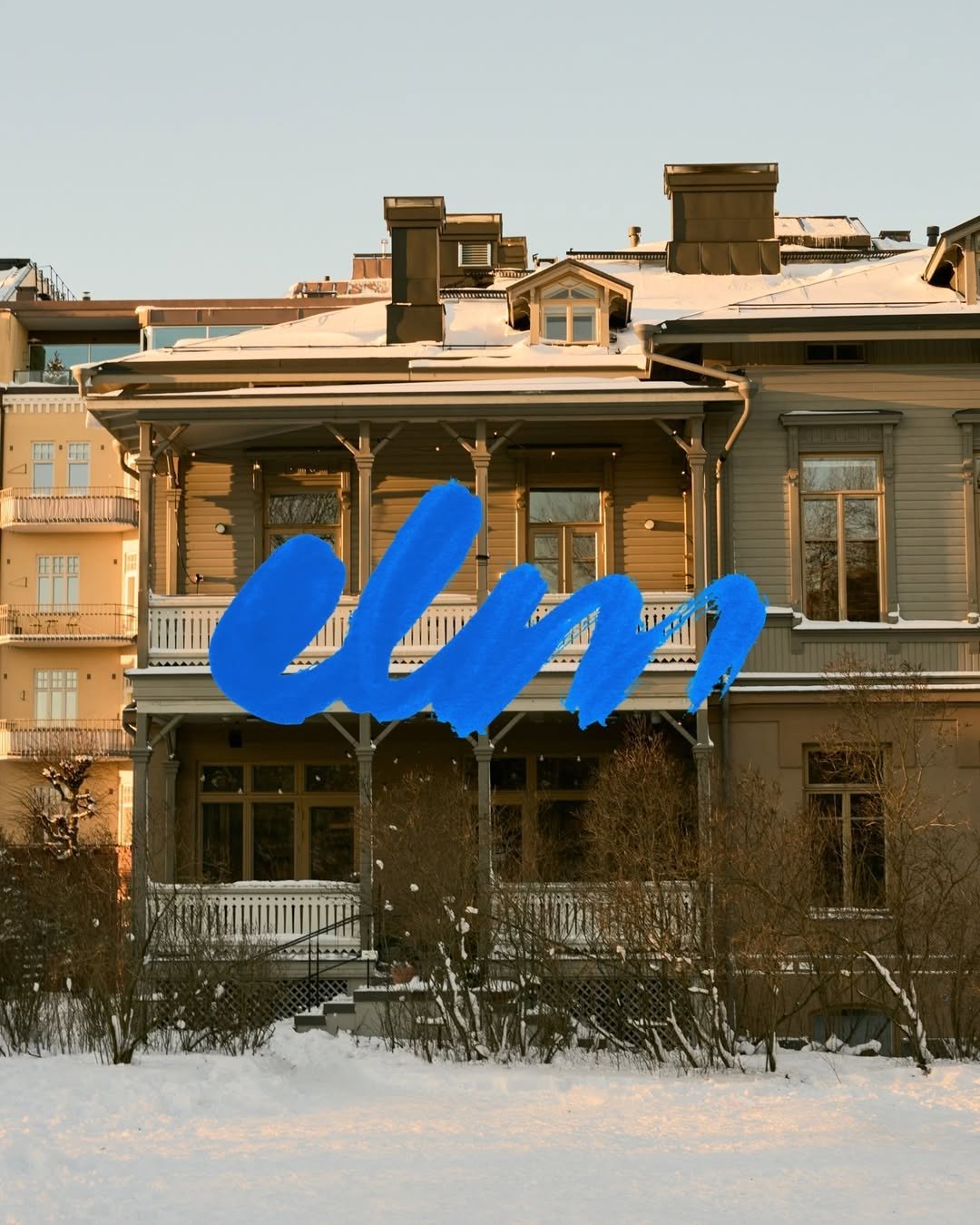 ⊟ 10Brand crushwelovebranding
welovebranding
That thick, wet-brush cobalt blue heavily layered over the muted, snow-dusted timber facade creates immediate friction. The sheer scale and texture of the mark acts as a physical intervention, completely disregarding the architectural grid behind it.
infinite_mantra
Look at how the dense indigo pigment pools and holds at the outer edge, contrasting against the matte peach paper. The tension here lives between those highly structured, radiating fine lines in the centre and the completely organic, unpredictable ink bleed on the perimeter.
 ⊟ 17Brand crushjackofbrands
jackofbrands
Look closely at the precise Pantone match between the canvas awning, the heavy wool coat, and the paper carrier bag in motion. Owning a single, deeply saturated colour across totally different material textures builds more brand weight than plastering a logo on everything in sight.
 Brand crushgraphicdesignersgroup
graphicdesignersgroup
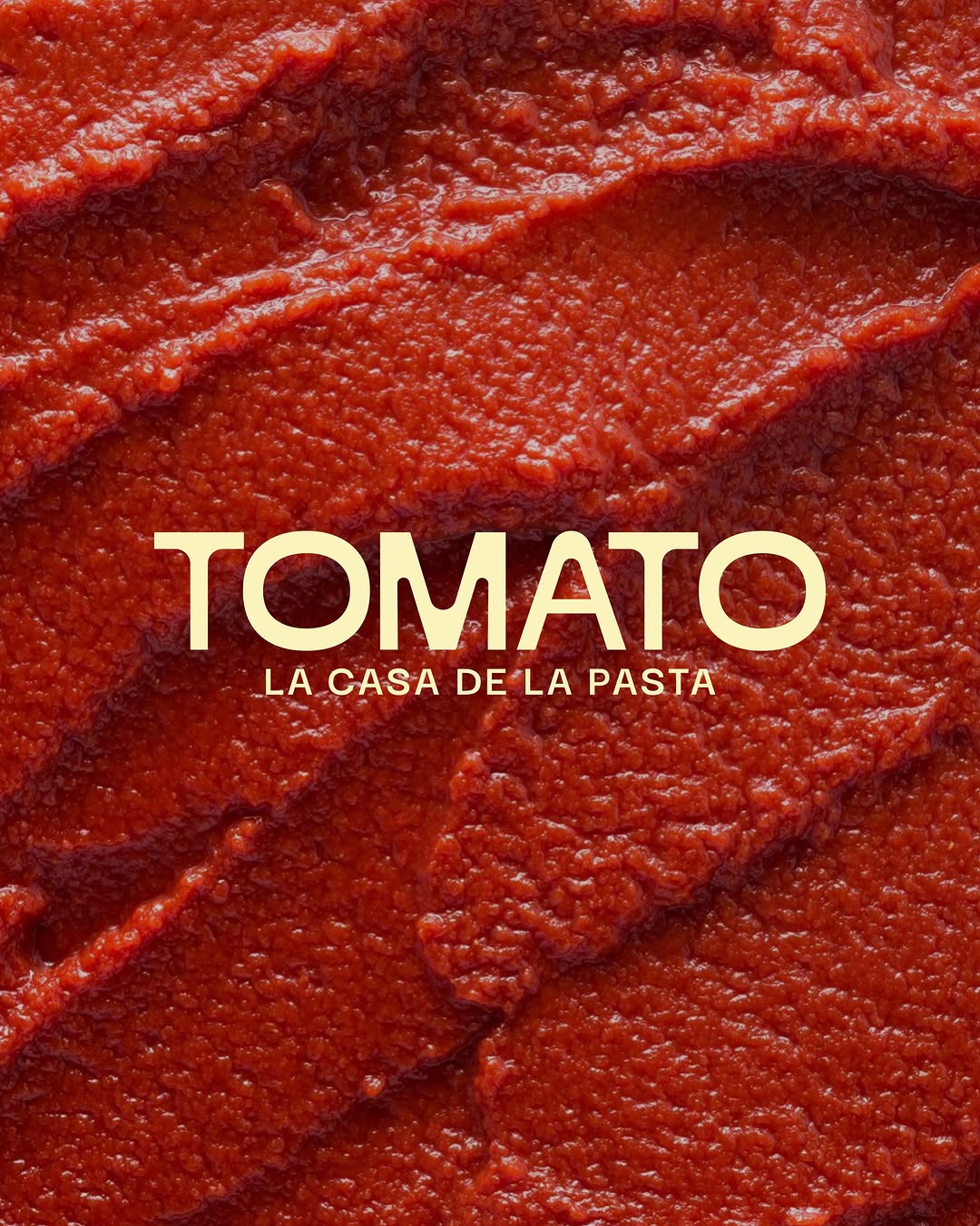
The crisp white border of the Pantone card casts a subtle drop shadow against a flooded red surface, anchoring the organic mess of strawberry seeds and water droplets. They tied their exact brand red to a visceral, physical object, turning a clinical colour code into a sensory cue.
 ⊟ 5Brand crushuncocostudio
uncocostudio
The same 'stop and brand' principle as the quietest studios — soft serifs, generous spacing — deployed by a colour-forward practice. Proof that playful doesn't require a novelty typeface: the palette brings the party, the type keeps the receipts.
 ⊟ 7Brand crushwelovebranding
welovebranding
The motion blur on the basket and trees grounds this image in a fleeting moment, while the generously tracked serif typography stays perfectly sharp. Setting quiet, spacious text against an active background creates a tension that makes you stop scrolling.
gonnnnzzzzalo
Notice the deep shadows cutting across the sunlit crests of the grass. Relying on organic texture and natural light rather than heavy ink floods gives a surface an inherent, quiet weight.
organik_festival
Look at the focal blur on the moss and how the crisp, micro-spaced text sits over it to build a silhouette. Using the wordmark as a pointillist texture rather than a standard logo stamp allows the branding to fuse entirely with the physical environment.
loewe_perfumes
The extreme macro shot of the iris and skin texture creates an intimate, almost intrusive backdrop. Dropping a sharp, flat yellow serif right over that organic warmth lets the typography do the heavy lifting without showing a single product.
 ⊟ 5Brand crushuncocostudio
Brand study
Stripping away the packaging to lay a quiet, generously tracked wordmark directly over a hyper-textured macro shot is a deliberate trust play. It signals absolute confidence in the raw material, forcing the viewer's brain to process the sensory weight of the product before it even registers the brand name.
Brand study
br.and.ing leans on effortless, wearable restraint, the kind of identity that assumes it belongs rather than asking to. Quiet confidence is the whole register, soft spacing, nothing raised in volume, presence without announcement. It's exactly how considered hospitality treats a guest: expected, unhurried, never performed at. For gifting and branded apparel the lesson is to design for actual use, pieces someone reaches for because they're good, not because they carry a logo. Keep the mark small enough to live on a lapel or a cuff without dominating it. When branded goods earn their place by being genuinely wearable, the recipient does the promotion for you, quietly and for years.
Brand study
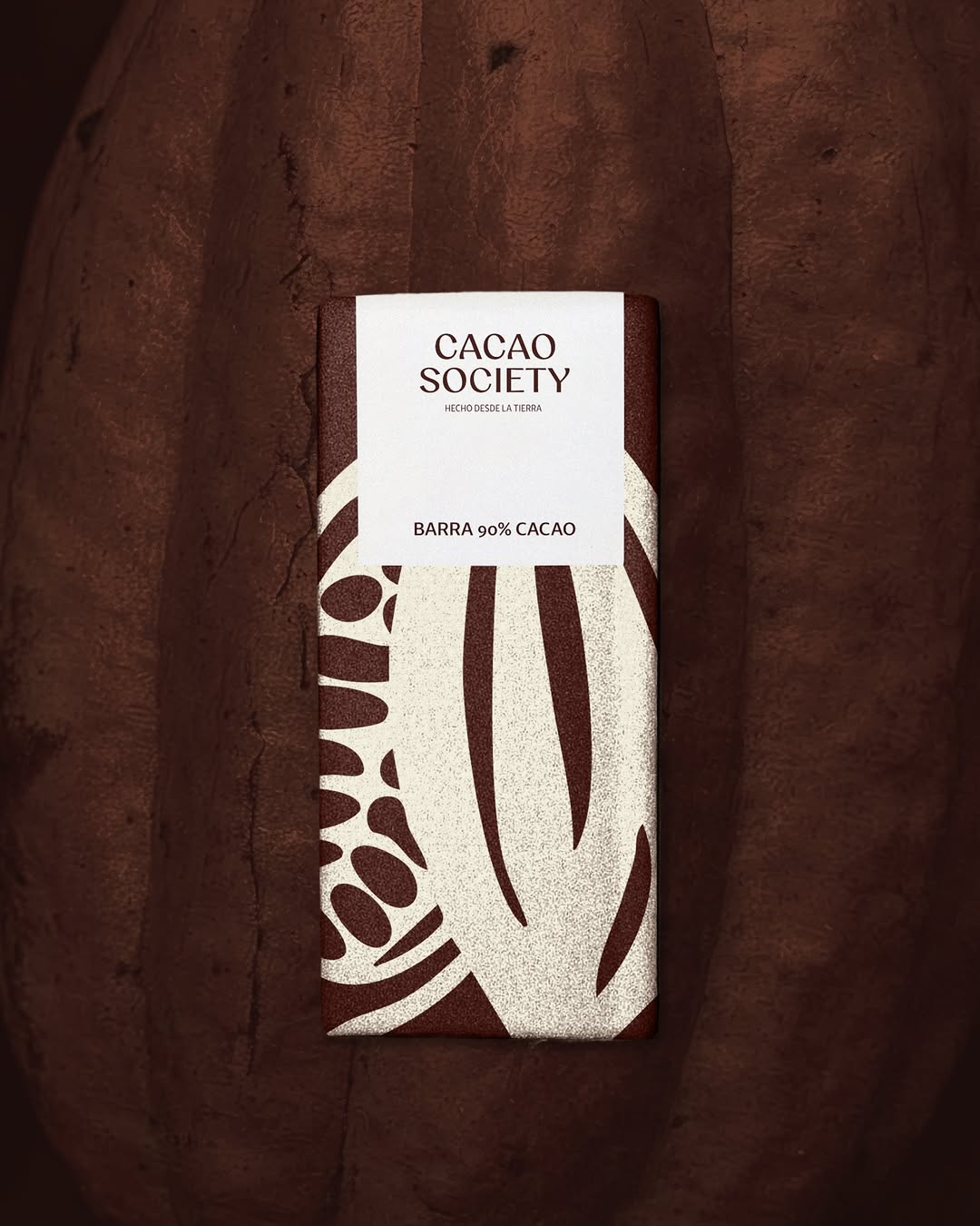
Establishing market authority often means knowing what to leave out. Committing to a singular, immersive macro-texture while reducing the logo to a quietly spaced wordmark builds premium positioning before the audience processes a single rational claim.
Brand study
Embedding a sharply milled gold monogram among vintage bone and resin dice signals effortless ownership of the leisure space. The strategic bet here is that a quiet, tactile intervention builds stronger brand recall than a high-contrast logo slap ever could.
Brand study
An identity built from the flower's own environment — love, calm, warmth translated into palette and mark. What makes it studio-grade is the derivation: every element traces back to one researched source. That's the method worth stealing — pick a single real-world referent and mine it systematically, rather than moodboarding twenty.
 ⊟ 9Brand crushjdomito_
Brand study
jdomito treats an identity as a coordinated system rather than a single logo, every element chosen to speak softly and match. That system thinking is the heart of hotel-grade hospitality, where the key card, the robe tag and the notepaper all feel art-directed by the same hand. For gifting it's the difference between a good object and a good experience. The box, card, tissue and product should look like they were designed in one sitting, sharing type, colour and material logic. When every touchpoint agrees with the others, the recipient reads care and coherence before they read the brand name. Consistency across the set is what makes the whole thing feel expensive.
Brand study
Naming, colours, type, textures and patterns built as one hospitality-grade system — everything speaks softly and matches. The takeaway for boutique-hotel gifting is system thinking: the box, card, tissue and object should feel art-directed together, the way a good hotel's key card matches its bathrobe tag.
Brand study
Treating a dense, chaotic forest like standard wrapping paper is a quiet flex. They dropped a polite, widely tracked wordmark right over all that organic noise, letting the extreme contrast do all the heavy lifting.
 ⊟ 4Brand crushmonpalette_
Brand study
The client asked for 'modern and easy to read' without losing craft credibility — and the answer was an earth palette applied with system discipline: consistent margins, one type family, cacao browns used like a corporate colour. Proof that earthy ≠ folksy. If your brand fears looking 'handmade at a market', this is the fix: keep the palette organic, make the grid ruthless.
Brand study
Single-colour flexo print on a bleached kraft stock proves you do not need a four-colour process to hold attention. They have used the sheer scale of the vertical block typography to turn a standard takeaway vessel into a walking billboard, while the matte terracotta ink grounds it in a tactile warmth.
olliecatton_designs
Look at how the 'c' and 'a' physically merge in this frame to carve out a hidden shape in the negative space. It is a clever typographic trap that forces the eye to stop and solve the puzzle, making a static olive-on-chartreuse wordmark feel highly intentional.
THE SENSE2 PERSPECTIVE
Inspiration becomes valuable when it changes the brief
We collect ideas from architecture, hospitality, fashion, packaging, interiors, culture and the natural world — because the best merchandise thinking rarely begins inside a merchandise catalogue.
The Sense2 perspective translates those ideas into practical brand decisions: which material will carry the message, how the identity should behave, what the recipient will feel, which object belongs naturally in their life, and what detail will make the campaign unmistakably yours.
Bring us the feeling
You don't need to begin with a product. Send us a colour, a place, a brand reference, a hotel, a material, an image — or simply the way you want people to feel. We'll translate it into merchandise.
Ask Findie to translate it →Want something like these?
Ask Findie for a quick conversation, or hand the brief to Susan and the team. Either works.