Brand crush
@ten.10.design
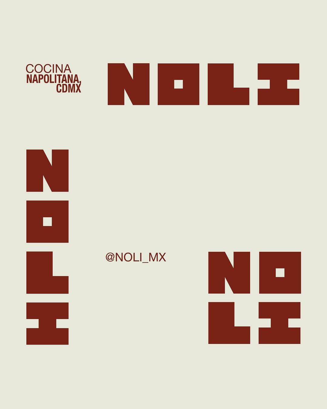
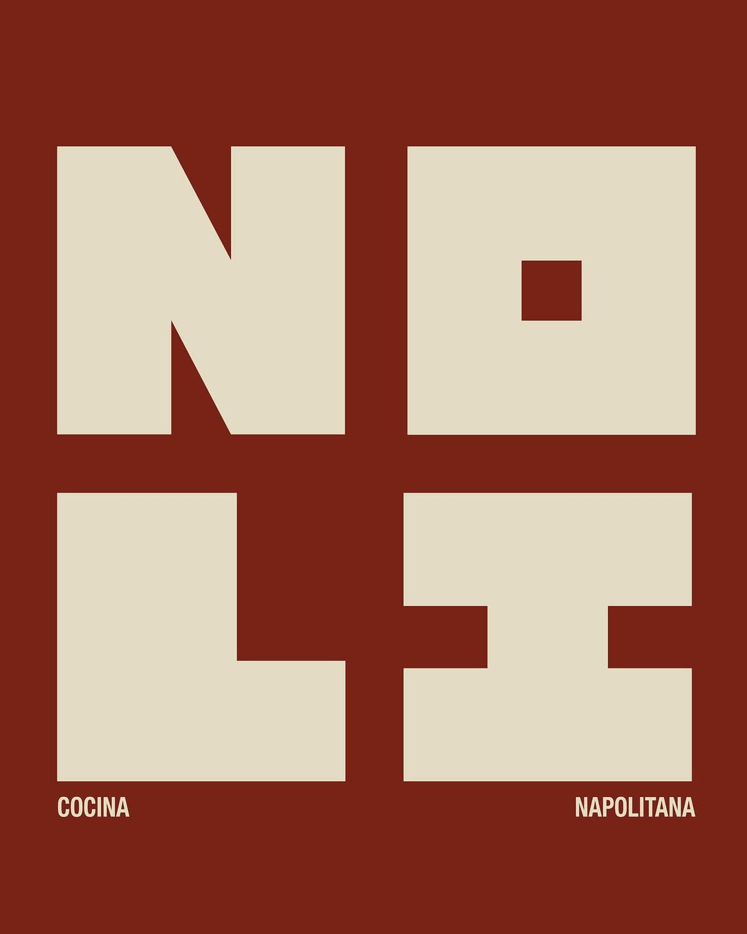
[ Naming + Branding Project ] NOLI — CDMX (Mexico)
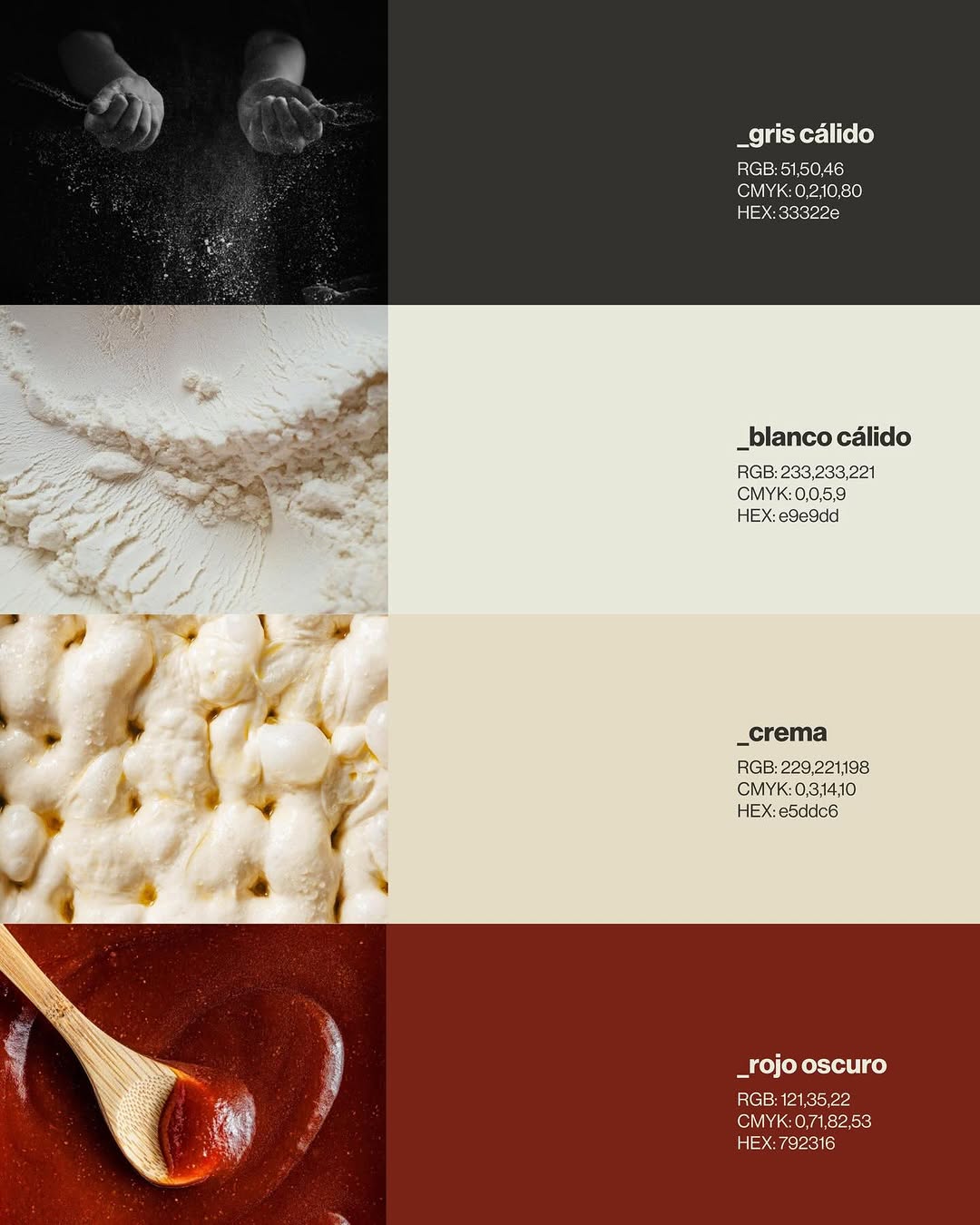
Logo / Identidad / Colores / Tipografías / Texturas / Patterns
Prossimamente en Chicago 113, Esq Av. del Parque, Nápoles📍
21 May 2026spotted via @ten.10.design
Brand crush
[ Naming + Branding Project ] NOLI — CDMX (Mexico)
Logo / Identidad / Colores / Tipografías / Texturas / Patterns
Prossimamente en Chicago 113, Esq Av. del Parque, Nápoles📍
More moments worth a look.

Look closely at the precise Pantone match between the canvas awning, the heavy wool coat, and the paper carrier bag in motion. Owning a single, deeply saturated colour across totally different material textures builds more brand weight than plastering a logo on everything in sight.

The deep shadows pooling in those circular impressions do all the work here. By relying entirely on a blind deboss against a heavy, granular metallic texture, the mark feels permanent and tactile rather than just printed on top.
Stop and brand. A wordmark like uncocostudio's — soft serifs, generous spacing, one quiet colour — does the heavy lifting before a single customer walks in. Identity by @uncocostudio. We've been thinking about it since. #sense2lovesbranding #promotionalproductsaustralia #brandedmerchaustralia #corporategiftsaustralia #australianbrandidentity #brandcrushoftheweek #stopandbrand #storiesmakebrands
Ask Findie for a quick conversation, or hand the brief to Susan and the team. Either works.